How Golden Ratio Typography Increased My Blog’s Readership by 45.72%

How do you decide the font, line spacing and the content width for your blog or website content? If you were like me, you probably went ahead with what you thought was the best for your users. And more often that not, the choice represents our own tastes when choosing such elements for our content properties.

It is time to stop guessing and start taking decisions based on mathematic and scientific principles. Let me introduce you to golden ratio typography. Before we get into what is golden ratio and golden ratio typography, let me first show you the results I got after implementing this typography on my blog.
How Golden Ratio Typography Helped This Blog
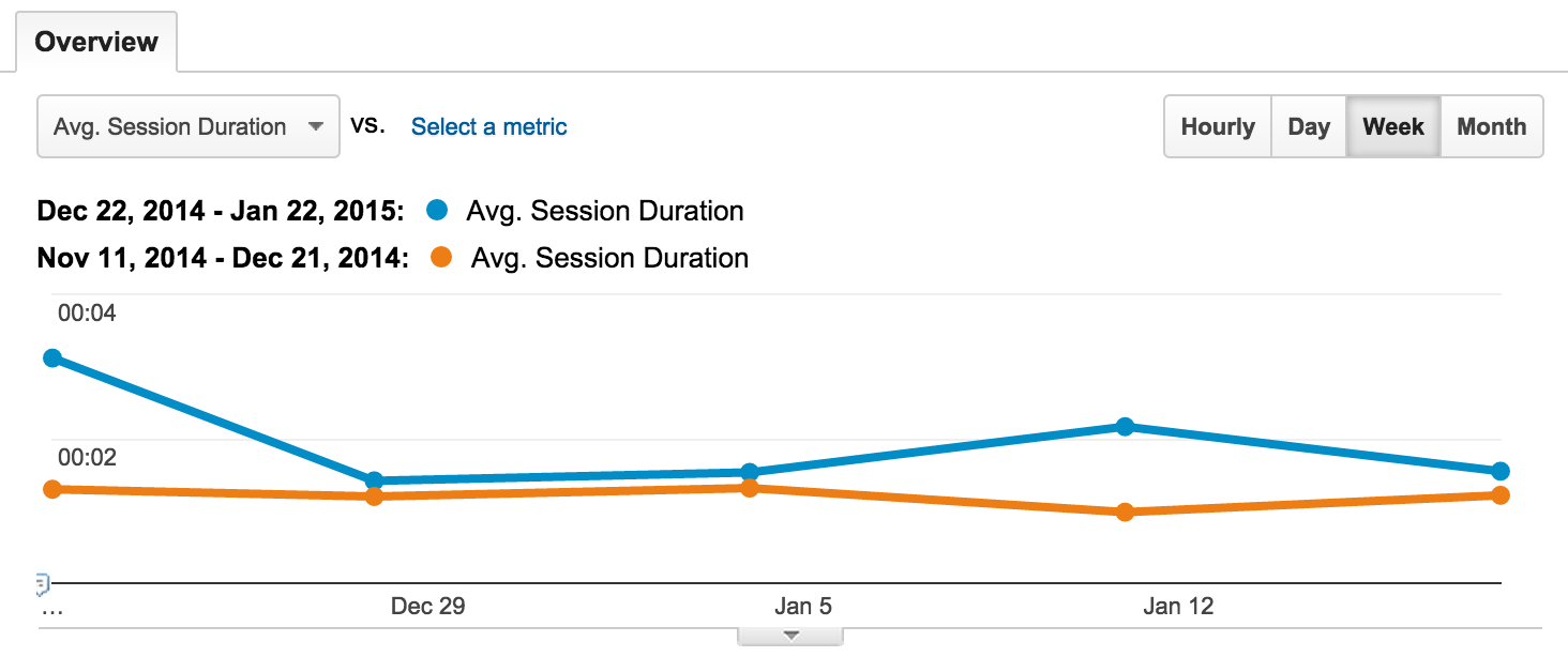
I changed my blog’s typography on December 22nd 2014 to golden ratio. I have compared the 30 days before and after this change. According to Google Analytics, my readership has improved by 45.72%.

I have taken time spent on the site as the core indicator of readership. Since the content in my blog is more comfortable to read, people are spending more time on the site.
People used to spend on average 1 minute and 19 seconds on my site, but now they are spending 1 minute and 55 seconds. The bounce rate has reduced by 3.67% and people are visiting more pages on every visit.
The pages per session has improved from 1.36 to 1.59. I have also taken different date ranges and re-verified this fact. I have also received comments from my readers that my new typography is comfortable to read.

In the above graph the blue line represents to time spent on site (average session duration) for one month after golden ratio typography was deployed. The orange line indicates the avg. session duration for one month before the change. There is a clear sign of improvement.
What is the Golden Ratio?
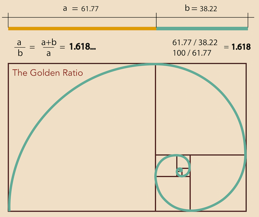
The golden ratio is arrived through the formula (a/b) = (a+b)/a. The values of a and b should be in such a way that it fits this equation. The ratio comes to 1 : 1.618 approximately. The golden ratio is also known as the golden number or phi.
The golden ratio is a magic number which has huge significance in nature’s design. It has also been observed that famous painting and architectural elements have golden ratios in their design. The inverse of 1.618 is 0.618 and vice versa – which cannot be reproduced with any other set of numbers.
There is also a very strong relationship between the golden ratio and the Fibonacci sequence. I recommend that you refer this Wikipedia article to learn more about the golden ratio. Golden ratio is a very deep subject and if you dive in, you can get lost in the sea of information available out there.
The basic idea to take away is that: the Golden ratio when incorporated in the design of anything will have a significantly higher appeal than the elements without this ratio.
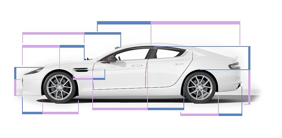
The design of Aston Martin Rapide S is based on the golden ratio and their website explicitly states that fact.

“The ‘Golden Ratio’ sits at the heart of every Aston Martin. Balanced from any angle, each exterior line of Rapide S works in concert and every proportion is precisely measured to create a lithe, pure form.”
– Aston Martin
Explaining everything about the golden ratio is beyond the scope of this article. But as far as I know, every great design including famous buildings’ architecture, cars, logos, electronics and paintings have elements of golden ratio in it.
One of the reasons why it is appealing to the human eye is that the golden ratio frequent in a lot of nature’s design elements including trees, spiral shells and human facial features. If you search for examples of golden ratio in nature, you will get plenty of references.
Now that we know golden ratio is not just another number, let’s see how it can be applied to blog’s typography.
The Golden Ratio Typography
Chris Pearson, the creator of the thesis theme, has studied the golden ratio and web typography extensively and came up with the golden ratio typography.
“Typography is a combination of artistic letterforms and mathematical proportions, an exquisite marriage of form and function. When the mathematical proportions of your typography are harmonious, your site—and your content, specifically—look appealing to readers.” – Chris Pearson
According to Chris, the three primary factors which influence your website’s typography are:
- Font Size
- Line Height
- Line Width
If you are interested in diving deeper on the golden ratio typography, I recommend that you read Chris’ long blog post about golden ratio typography.
But, if you are a bit lazy like me, you can just implement golden ratio typography on your blog and not worry about how it works 🙂
Implementing Golden Ratio Typography
It all comes down to this: the font size, line height and line width have to be proportional to each other. If they are, the typography will be visually appealing to the readers of your website or blog content.
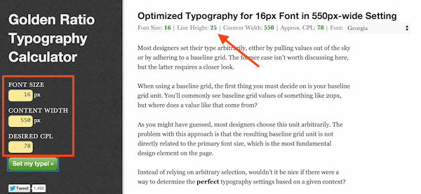
To help you get the numbers right, Chris has come up with the Golden Ratio Typography calculator!
All you need to do is enter the font size, content width and desired characters per line and it will tell you what the recommended line height is.

It is recommended that CPL value is between 70-80 for comfortable reading. If the content is too long, readers will find it difficult to track the beginning of the next line.
Most of the themes do not have a feature for adjusting the line height. You can adjust the line height using CSS. You need to include the following code in your CSS to change the line height for paragraphs.
p { line-height: 25px; }
I have also changed the font color from absolute black to dark grey (80% black). Absolute black has too much contrast with a white background and strains the eye while reading. The color code for 80% black is #333333.
Another option would be to keep the font color at absolute black and make the background off white instead of absolute white.
Conclusion
My blog may not have the best typography in the world, but I am sure that it is better than most of the blogs out there with random numbers for font size, line width and height.
If you have ideas to further improve the readability, let me know. If you haven’t done anything about your content’s typography yet, go ahead and make it all golden! I am sure you will see an improvement in your blog’s stickiness factor.
And if you liked this article, please tweet, share on facebook or LinkedIn!