How to Use Data from Heat-Maps to Improve User Experience & Conversions

Marketing is all about traffic and conversions. Traffic can be generated by targeting the right people at the right place & time. Conversion depends on effective communication & trust.

To get more sales, you can either work on increasing your traffic or your conversions. More traffic costs more money. But, conversions can be achieved with a few tweaks and doesn’t always cost money. There are different ways to improve conversion ratio, but the most common methods are split testing and heat-maps.
A conversion doesn’t mean a sale as most people assume. There are different types of conversions in the marketing funnel. An ad impression to an ad click is a conversion. An ad click to a free trial registration is also a conversion. A free trial user making a payment to become a customer is another conversion point.
As a general rule, the more conversion points we have in the marketing funnel, the more opportunities you have for conversion optimization. When we improve the conversion at each stage, it will help increase the overall conversion rate from the first to the last action.
Why Split Testing is Inadequate?
Let’s say you are running a display ad campaign. The basic way to optimise is to run two variants of the ad and see which performs better. It is easy to run such tests with the various tools available today.
Such split testing experiments were carried out even before the era of digital marketing and online advertising. Marketers used to run two different variants of an ad in two major newspapers. Then they would track which ad got a better response by tracking the calls triggered by these ads. Each ad variant had a different phone number for tracking the effectiveness of the ad copy.
The tracking was done manually by the sales people who answered the incoming calls. It took a lot of energy & time for such manual tracking, but the marketers knew that split testing was mandatory to make the best use of their marketing dollars.
Digital Marketing & Technology has made things faster and simpler. It is easier to track visits, clicks and leads, and now even a hobby blogger can run split tests on his blog.
Limitations in Split Testing Landing Pages
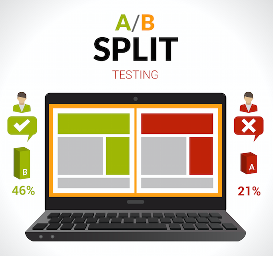
Split testing works great for optimizing landing pages. You can drive 50% of the traffic to landing page A and 50% to landing page B and see which converts better.

When you find out that one landing page B converts better than the other, you can further split test it with another variant C until you reach a satisfactory conversion rate.
But the problem with split testing is that there could be another version X, that could convert far better than your variations A, B or C. Split testing is usually done with minor changes in wording, layout and colors. You cannot split test your way to variant X.
The Ideal Landing Page – Variant X
To start a split-testing experiment with landing pages; a digital marketer creates a landing page variant with minor changes from the original page. He does these minor changes with an educated guess (a hypothesis) about what your customers would want.
Here, split testing only helps you prove or disprove your hypothesis. But, it does not help you learn what your customers want.
To build the ideal landing page X you have to understand your customers better. The marketer should join the conversation that the prospect already has in his mind when he is searching for a solution to his problems.
If you do not understand what your customers need, all your variations will fail. You may be able to achieve a small increase in conversions, but it would not be enough to take a business to massive profits.
One of the best ways to understand more about your customer is to talk to them and find out where they come from. Listen to their words and use the same words in the ad & sales copies.
However, there are certain things that your customers will not tell you. There are things that the customer don’t know about themselves.
If you start monitoring visitor’s behaviour on your website, you can gain many insights. Certain actions are driven by the customer’s subconscious mind; like colors that motivate them to click on the buy button.
How to Monitor Your Visitor’s Behaviour
Google Analytics is a great tool for monitoring visitor behaviour and making changes accordingly. But Google Analytics does not provide heat maps that will tell you where the users have clicked and how they navigate through your site.
When you monitor the clicks on your website, you will know which sections of your website perform better. You will also know the areas that are ignored by your visitors. You should replace those ignored sections with stuff that your visitors want.
There are many tools that will give you more insights into the click and scroll pattern of your website visitors. Some of the top players in the market are:
Heat Mapping Tools for Digital Marketers:
- CrazyEgg.com
- HeatMap.me
- ClickTale.com
- SumoMe.com
- MouseFlow.com
- HotSpots Analytics (WordPress Plugin)
I am yet to try most of the tools listed above. I will eventually use every tool and post a review of each of those tools. I will also publish a comparison of the different heat mapping tools and give my verdict.
This post is more about the importance of using heat maps and taking relevant decisions on the website elements, than reviewing the tools.
For the purpose of this post, I have just used CrazyEgg and analyzed the user behaviour on my blog.
Using Heat Maps for DigitalDeepak.com
Within a few days of using CrazyEgg.com, I was impressed by the volume of insights I gained on user’s behaviour on my website. CrazyEgg provides a free 30-day trial with which you can track 10,000 visits on 10 different pages.
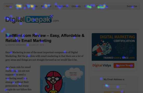
I installed CrazyEgg on DigitalDeepak.com, and this is the click map I got after driving around 1,000 visitors to the page.

(Click here for a larger version of this image)
From this heat map, I was able to understand how my visitors interact with my website. I noticed that certain areas get more attention than expected, and other areas are being ignored. Based on the click pattern I am making to following changes on my website:
Change 1: Remove Non-performing Links
The first change that I can make on the site is to remove the link to the Glossary page in the navigation bar that doesn’t get any attention or clicks. A website’s real-estate, especially above the fold, is precious. I can include some other link that would perform better.
Change 2: Highlight ‘Contact Me’
I noticed that the Contact Me button gets clicked more than I expected, so I highlighted it but pointing an arrow towards it with hand written words : Get in Touch! This will give a boost to an already well-performing link. Most of the people who contact me directly are my potential clients & customers.

Change 3: Remove Recent Posts & Archives
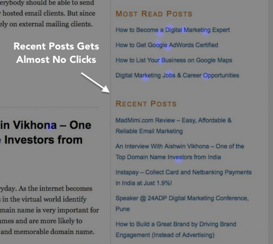
I also noticed that ‘Most Read Posts’ gets a lot more clicks than Recently Published Posts, so I am removing the recent posts and will be replacing it with more top posts from different categories.

Change 4: Enhance About The Author Section
About the Author gets more attention than I expected. It is time to expand this section. I will consider including the widget from Clarity.fm

I also noticed that people get to the Contact Me page from the button below this section. It would help highlighting this button.
Conclusion
I hope this article gave you an idea about how to use heat-maps and the insights you can gain from such heat-maps.
Since there are many tools that give a free trial, I encourage you to start using it today. CrazyEgg.com is a good option. Even if you get little traffic, you would still get some insights that you wouldn’t get from other sources.
Any questions about heat maps? Leave a comment below.